FEATSOCKS
A Series of Experiments on a Subscription Ecommerce Site
OVERVIEW
MY ROLE
UX & UI Designer at Conversion Fanatics
CHALLENGE
Featsocks is an ecommerce site, that came to us to optimize their offerings and site. Some of my primary goals included enhancing the subscription purchasing experience, making the purchasing flow more intuitive for the users, and improving site speed.
TOOLS
- Pen & Paper
- Sketch
- HotJar
- Convert
- Google Analytics
- Principle
DISCOVERY
WORKING THROUGH A PROTO-PERSONA
A lot of users driven to the site are coming through facebook ads. I used the data they target as well as demographics from google analytics in order to form my persona.
Dave, 24 is Featsocks’ bro-esque power-user. He mostly uses his phone for online shopping (72% of users), since Facebook and Instagram have been able to nail down his taste. His favorite other brands include Chubbies, Warby Parker, & Bonobos.
THE SOCK SUBSCRIPTION LANDSCAPE
As the clients were interested in potentially adapting their offerings in order to optimize the full experience, I opted to conduct a competitive analysis to get a better handle on offerings as well as perceived value, this was the basis for Exp
PRIORITIZING EXPERIMENT PLAN
Experiments were prioritized in terms of executability, priority, as well as targeted areas. This is an ongoing project, but for the purpose of this case study I'll be focusing on a few key experiments.
- Experiment 1: Improving Mobile Navigation
- Experiment 2: Redesigning "Mystery Box"
- Experiment 3: Improving the Collections Page
EXP 1: Optimizing Mobile Search
DESIGNING SEARCH
From our heatmaps, we could tell that not many users were interacting with the search in its current formatting. The text was right aligned, and didn't have a clear button for submission. For this test, I wanted to gauge whether people respond better to a more focused version (v2) or a more accessible one (v1), with both including placeholder text to help the users as a signifier.
RESULTS
This experiment ran for 14 days. Variation 1 with the winning had the following results:
Completed Order: 4.81% CVR (+18.73% improvement, 98.5% significance)
Viewed Cart: 14.09% CVR (+13.75% improvement, 99.9% significance)
Viewed Search Page: 3.75% CVR (+56.21% change, 100% significance)
Search Engagement: 4.38% CVR (+71.6% change, 100% significance)
EXP 2: RESTRUCTURING & CONSOLIDATING OFFERINGS
TURNING 12 SOCKS INTO 1 PAIR= ENDLESS POSSIBILITIES
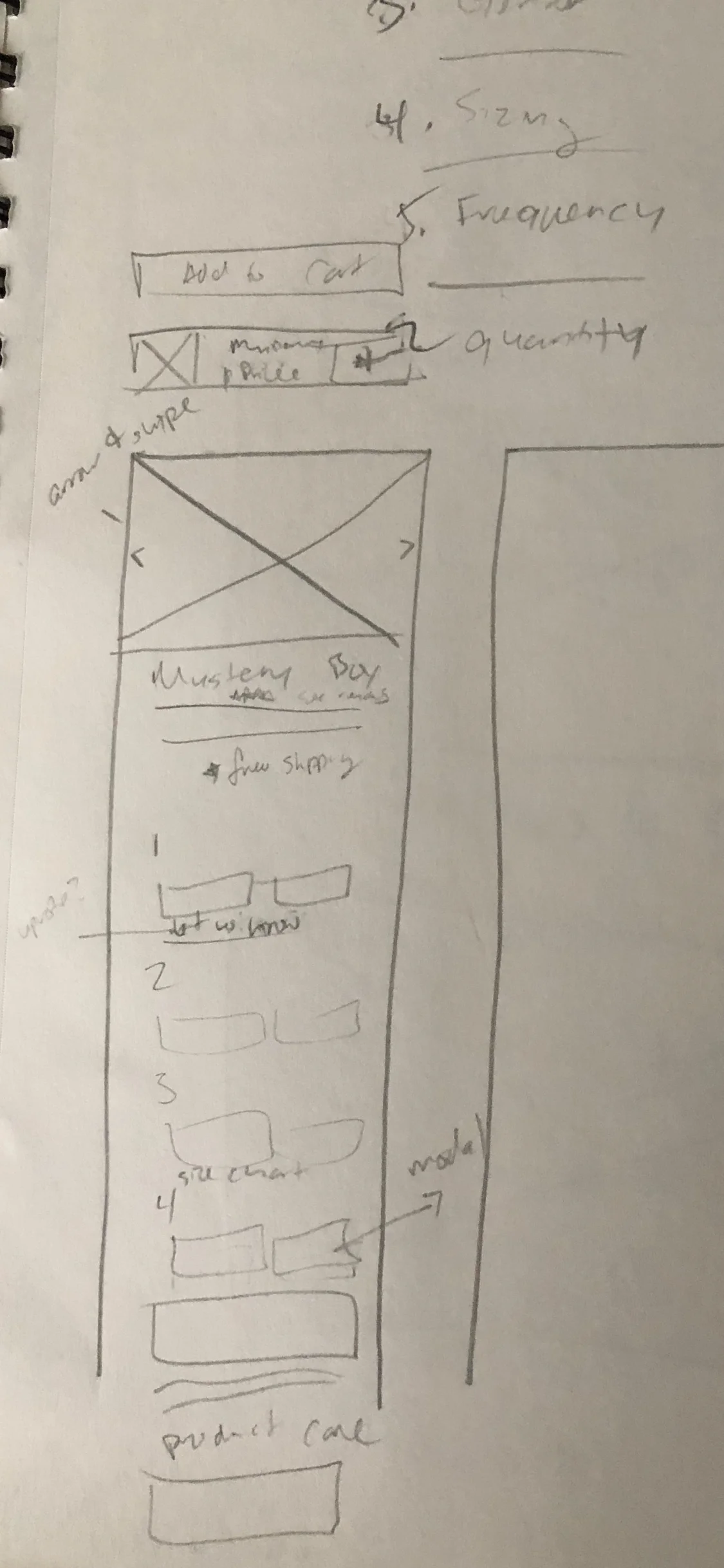
Basing on my competitive analysis I opted to consolidate options from 6 different products and make them all available in a quiz style format-- aiming to have the users get to their end goal quicker, as well as making it all more accessible. I also reworked the copy to make it a little more playful and conversational, to my dismay, it didn't make the final cut (picture 2 below). The pricing dynamically populated based on their selections, I had a similar concept in mind with the photos, but we ultimately ruled it as a bit too distracting for the user. Their selection method had been dropdown, and I opted for something more tappable, eliminating clicks for the user.
WITH POSSIBILITY, COMES ERROR
Upon the development phase, we ran into an unforeseen error state that my dev & I tackled in the development phase phase. No Show Socks only comes in a 9 Pack, which was the first question in the series. We bandaged it by using the same talkative helper text, and disabling some buttons.
RESULTS & FUTURE ITERATIONS
This version will be iterated on in the near future in order to improve error states. Below are the results from the experiment that ran for 7 days.
- Completed Orders: 2.33% CVR (+21% improvement, 99% confidence)
- Views to Cart: 16.87% CVR (64+ improvement, 99% confidence)
- Revenue Per Visitor: 19% improvement , 99% confidence
EXP 3: COLLECTIONS iterations
ITERATION 1: ADDING A CTA
I opted to instead do a quick shop option on the collections page. I opted for a modal with options for the selections, and worked through the different possible offerings. The modal eased up from the bottom of the screen on mobile and disappear both on click away and with "continue shopping" CTA.
ITERATION 2: MICRO-INTERACTIONS, ERROR STATES, & A CERTAIN SHADE OF BLUE
Ultimately, V1 had some missing elements we wanted to immediately iterate on, so we paused the experiment in order to work on them. We added:
- Better in line user error messaging, instead of just an error color around the content
- A clear path to check out, along with the option to click off and return to content
- A hover microinteraction on desktop version
NEW COLLECTIONS CONCEPTS
After conducting a small number of informational interviews with men who fit within their power user, as well as using some of the recordings and goals from our previous iterations, I opted for a different concept. I went for a more traditional grid layout, and we proceeded with two designs, v1 to let us see how users are interacting with the proposed filters, and v2 to limit the number of filters down to 2. The client wanted to draw more attention to the Build Your Own Box, so that was added in as well.
RESULTS ARE PENDING
But I can't wait to see what win, and iterate from there. ☺️


